

Georgia O’Keeffe (1887-1986) is often credited with being the ‘Mother of American Modernism’. She is best known for her large-scale, billowing flower paintings and the many landscapes she painted during her time in New Mexico, a place that she returned to again and again. From the cold and austere colour palettes of some of her flower paintings, to the hot and burning hues inspired by New Mexico, O’Keeffe was perhaps one of the greatest colourists of the 20th century. This article takes a look at the colours in her palette, and puts together three colour palettes inspired by the colour relationships in her work.

Photograph of Georgia O’Keeffe with her sketchbook and watercolours by her side taken by Alfred Atieglitz, 1918.
Georgia O’Keeffe’s Palette
In 2020, a collection of pigments from Georgia O’Keeffe’s studio went up for auction at Sotheby’s. The jars were labelled in her handwriting, but whether these dry pigments were actually used by O’Keeffe is uncertain, as she was known to purchase her oil paints from Winsor and Newton. Nevertheless, they give us an idea of the kinds of pigments she liked to use in her colour palette. They included Burnt Sienna, Purple Madder, Rose Madder, Raw Umber, Red Ochre, Yellow Ochre, Gamboge, Chrome Green (a mixture of Chrome Yellow and Prussian Blue), Cobalt Blue, Indigo, Zinc White, and Terre Verte.
These colours may not remarkable on their own, but how she used them certainly was. Her colour palette was very focused and intentional. She made colour swatches, and planned and refined the colours before putting brush to canvas. While there is creative freedom to be found in the spontaneous use of colour, there is also something to be said for a considered plan and a limited palette.

Blue and Green Music by Georgia O’Keeffe, 1921. Art Institute of Chicago
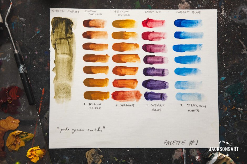
Colour Palette #1: Terre Verte, Burnt Sienna, Yellow Ochre, Carmine, and Cobalt Blue
The first palette is inspired by one of O’Keeffe’s recollections during one of her stays in New Mexico:
“I climbed way up on a pale green hill and in the evening light—the sun under the clouds—the colour effect was very strange—standing high on a pale green hill where I could look all around at the red, yellow, purple formations—miles all around—the colours all intensified by the pale grey green I was standing on.”O’Keeffe is experiencing, in a very real and embodied way, the effect that colours have on each other– a cool-toned Green Earth (PG23) intensifies the fiery hue of warm colours. So, with this in mind, the first palette is constructed around Green Earth:
I didn’t mix the Green Earth in the chart above because its a low-tinting colour compared with the others, and so it comes to the fore when used on its own. The moody purples made by Carmine and Cobalt Blue and the hot oranges of the Carmine and Yellow Ochre really set off the delicate coolness of the green. Overall this palette is balanced and versatile, running the gamut between cool and warm tones.
Colour Palette #2: Cobalt Blue, Carmine, Manganese Violet, and Cadmium Yellow
One striking thing about Georgia O’Keeffe’s palette is the way she put two similar colours next to each other in a way that reveals both their differences and their similarities, resulting in a kind of ‘tension’ between the two. In Sunrise, a watercolour study from 1916, she placed a bright purple-pink next to a hot red:

Sunrise by Georgia O’Keeffe, watercolour on paper, 1916
The cool purple-pink makes the red look comparatively warm, while the red brings out the blue-tones in the purple-pink. The yellow in the centre forms a focal point that, as a complementary colour to purple, further intensifies the purple tones in the surrounding colours. With this in mind, the next palette contains Carmine and Manganese Violet– two colours that aren’t very far from each other in the colour wheel (they are bluish red and reddish violet respectively). When used together they exhibit an interesting colour ‘tension’ we find in O’Keeffe’s work.
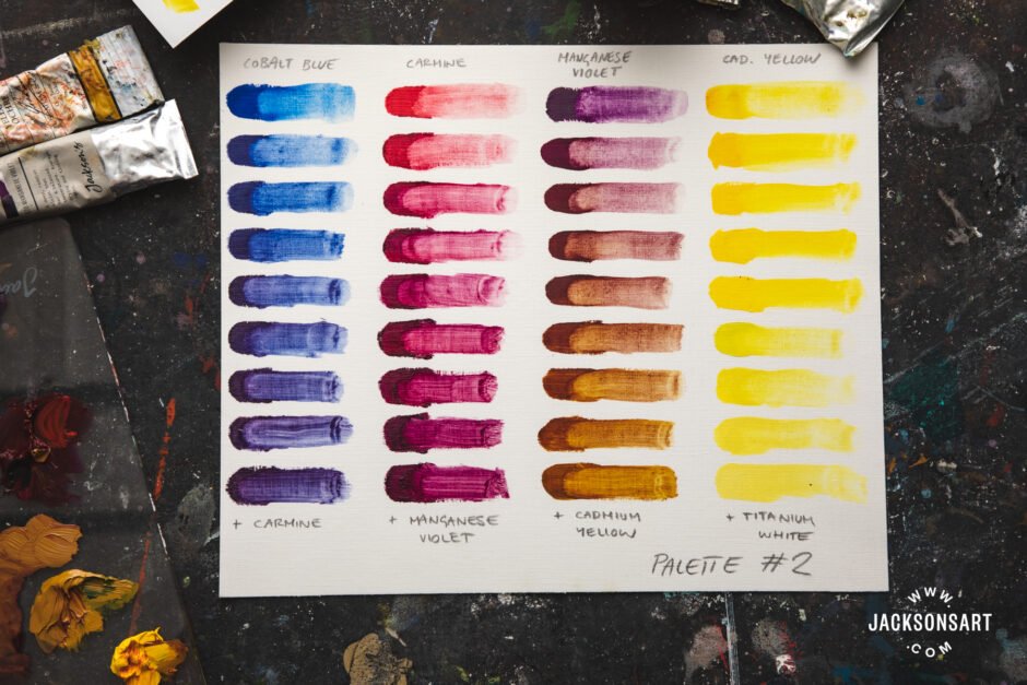
My first idea for this palette used a much more delicate yellow, but I realised that the purple-heavy mixtures of Cobalt Blue, Carmine, and Manganese Violet were crying out for an intense, opaque yellow to act as a complementary. The mixture of Manganese Violet and Cadmium Yellow might be of interest for portrait painters– it makes an interesting brownish orange that I wasn’t expecting!
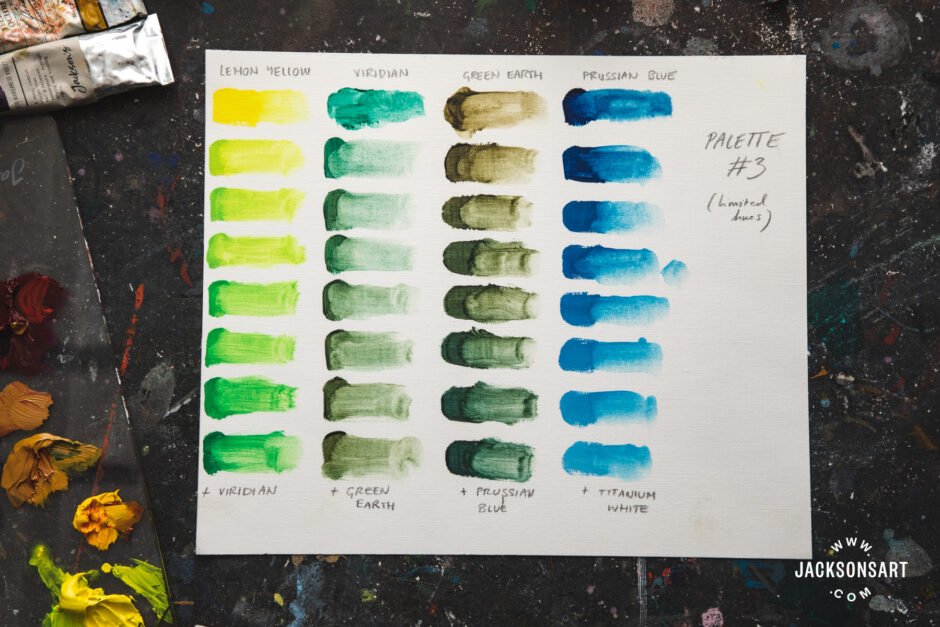
Colour Palette #3: Lemon Yellow, Viridian, Green Earth, and Prussian Blue
The previous two palettes have made use of complementary colours (i.e. yellow and purple, green and orange), but this last palette is inspired by another way that O’Keeffe uses colour- using a very narrow colour palette. A good example of this is her painting Blue and Green Music which you saw earlier in this post, but it’s a colour palette she used in some of her large-scale flower paintings as well. The following palette includes colours from a cool yellow (lemon yellow), a yellow-green (Terre Verte yellow-shade), a blue green (Viridian), and a green-blue (Prussian Blue). This small slice of the colour spectrum creates a unified, yet subdued, colour palette:
We can learn a lot from the artists of art history, and what Georgia O’Keeffe’s palette teaches us is that breaking away from the traditional primary-colour palette (in which all three primary colours are represented) can yield some interesting results. Which one of these palettes is your favourite?
Further Reading
Colour Mixing: Eight Blues in Eight Limited Palettes
Venetian Red: the Red Earth Pigment That Evokes the Italian Renaissance
Recreating Rembrandt’s Colour Palette With Modern Pigments